

Opportunity Tracking Redesign
Research Users Process, Wireframes, Clickable Prototypes, User Testing
Result
Improved the users experience by reducing 13 clicks to 4 clicks, thereby saving 62% efficiency.
Goal
To create an opportunity tracking interface that has a more organized approach and eliminate going in and out of pages for each individual client. As well as allowing the teams to update multiple opportunities at a time.
My Role
In our Agile team, I created sketches and wireframes. In addition, I was responsible for building clickable prototypes for the page layout, filters and functionality, and data grid layout.
I also created the icons and applied company standards and design patterns to ensure a consistent experience throughout the website.
Team
Product Manager, Business Analyst, Developer, Engineer
Problem
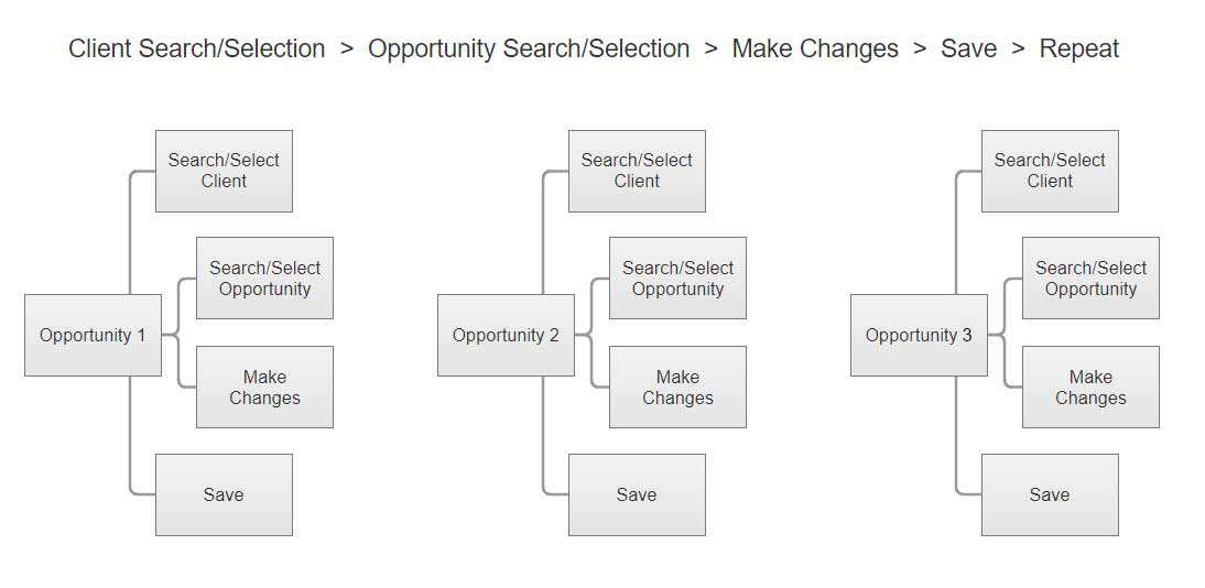
User could only add/edit one opportunity at a time, which was very time consuming.
UX Approach
Understand user’s workflow
Wireframes & Prototype
User Testing
Design
Workflow
I wanted to understand how the users were currently entering their data and the problems they were having. Going through the process myself, help me to experience what the user was going through as they performed these tasks.
Process prior to the redesign, the users had several steps to edit, add, or delete one opportunity.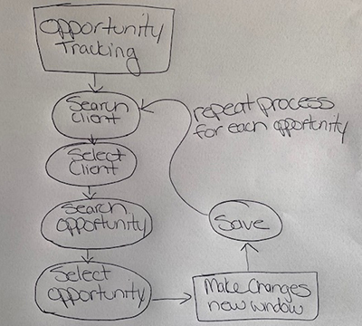
Low-Fidelity Sketches
Working through ideas for the datagrid.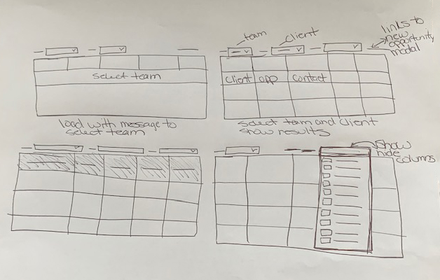
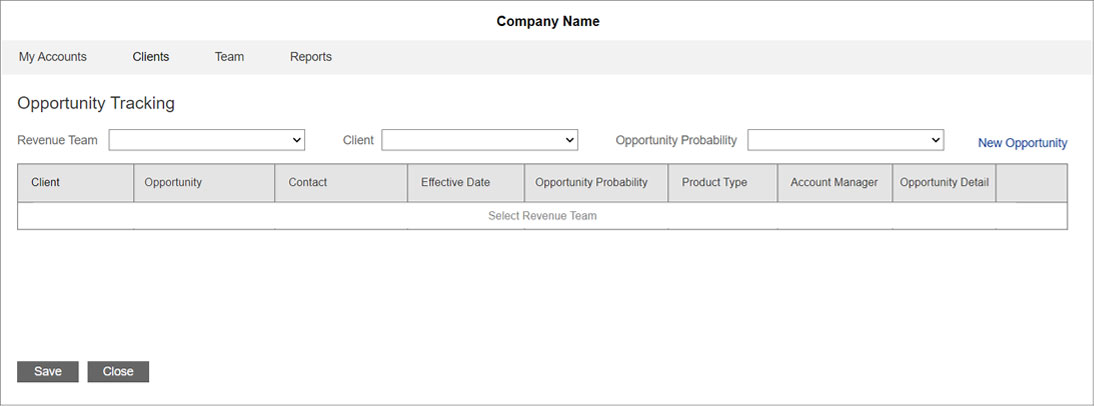
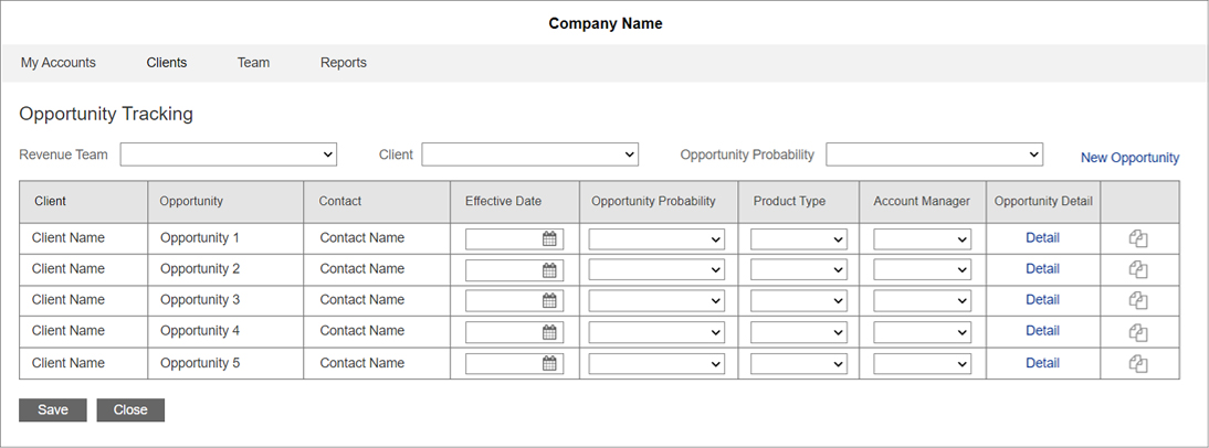
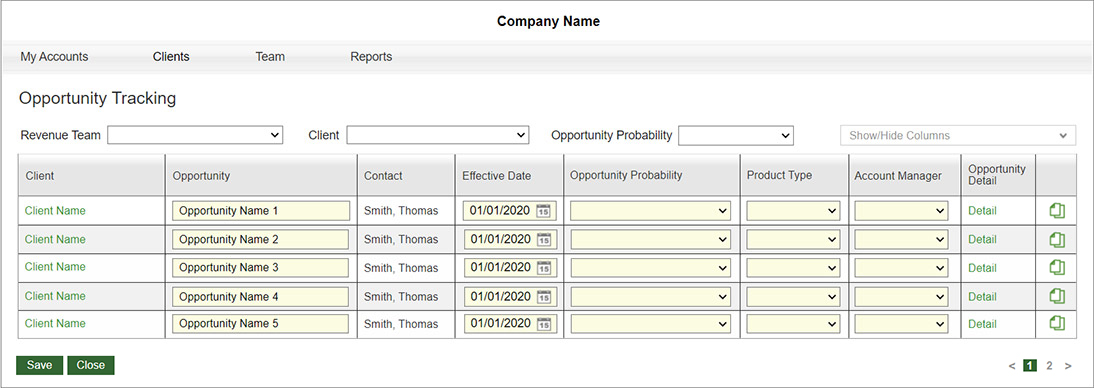
Wireframes and Design
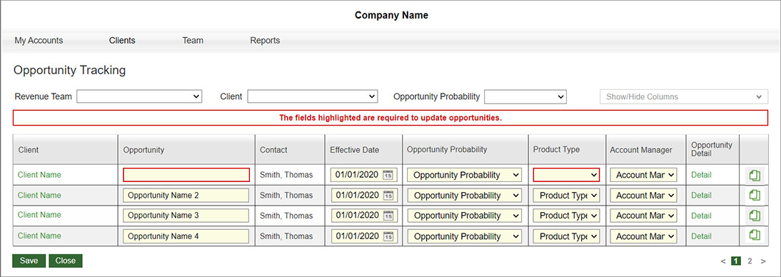
I designed the Opportunity Tracking to help the users perform these tasks more efficiently. The information is entered through filters and editable data grid. The filters work together to help reduce the results in the data grid. We updated the process to an editable data grid with filters and quick links for better usability that allows the users to edit, as well as add and delete up to 15 opportunities at once. Multiple opportunities can be edited and/or added at a time. Here are some wireframes that capture the essence of this experience.
Testing
Through the testing phase, we went through all functionality and messaging to make sure everything was performing correctly and all the validations were right before sending to development. I worked closely with the business analyst and developer through this process, as there were a number of bugs that we had to address.
Iterations
We had several discussions around filtering, and how the grid results would diplay. We also had to keep all the other current elements the users were using, without having a large number of results in the grid. In the end, we reduced grid results by having the first two filters above the grid work together, which resulted in more refined search results.